alprokoncorporate site
Client
Alprokon
Year
2022
Agency
-
Services
Visual design
Branding*
Art-direction*
*Assisted with
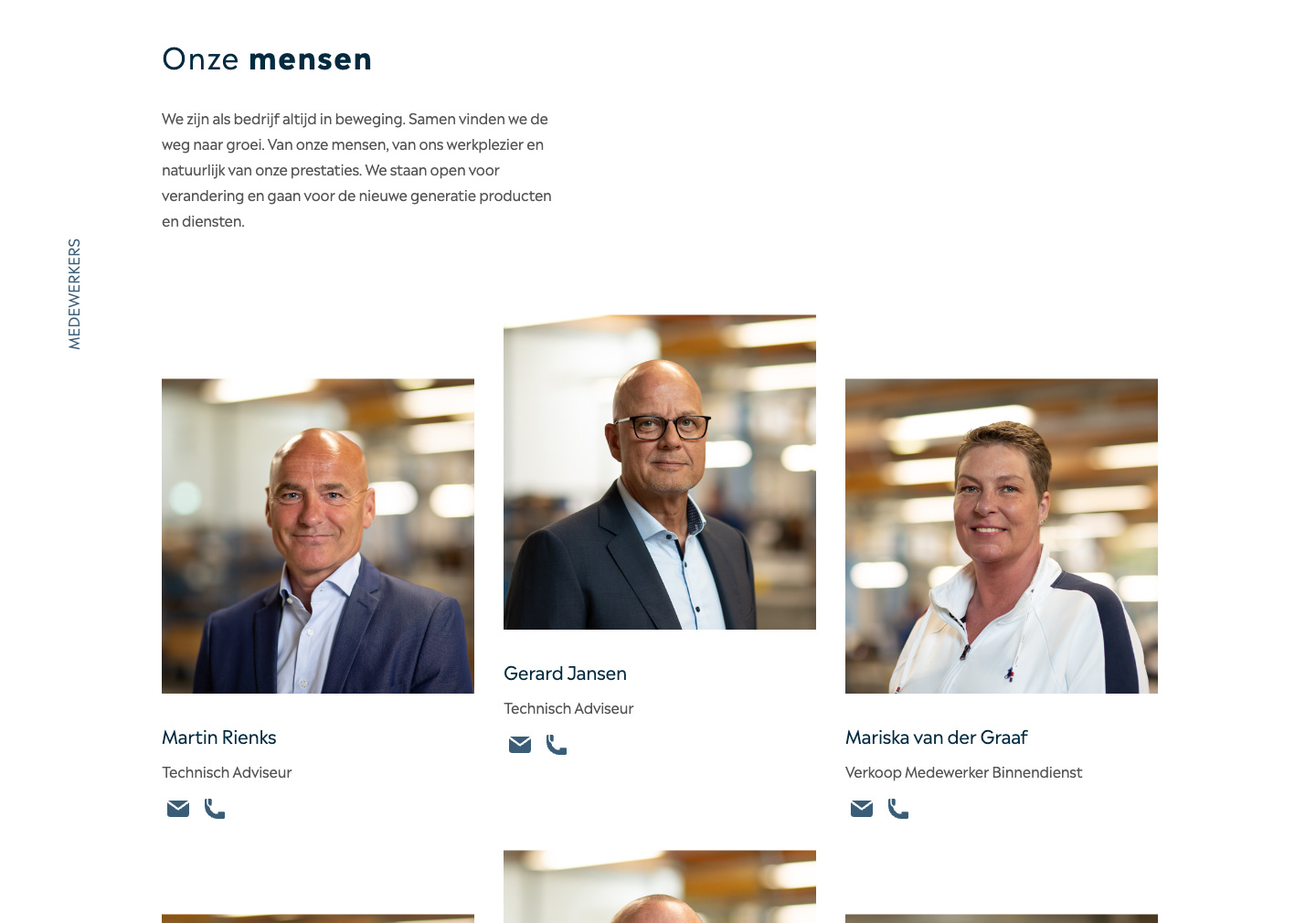
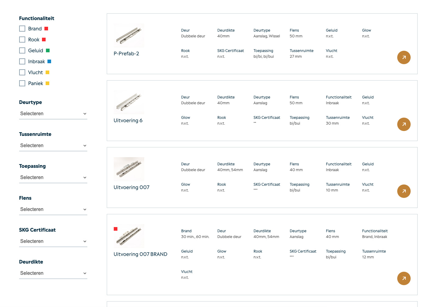
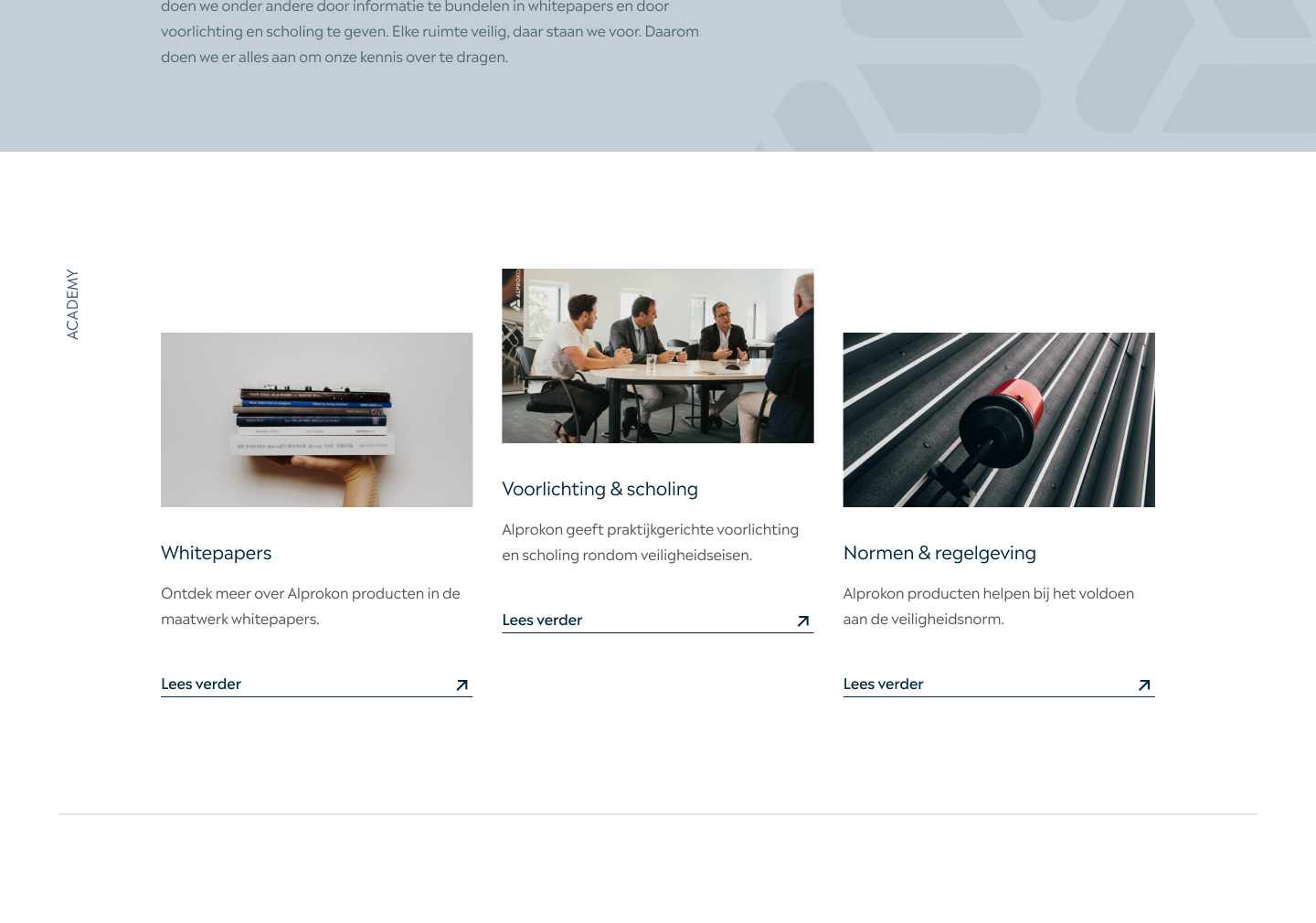
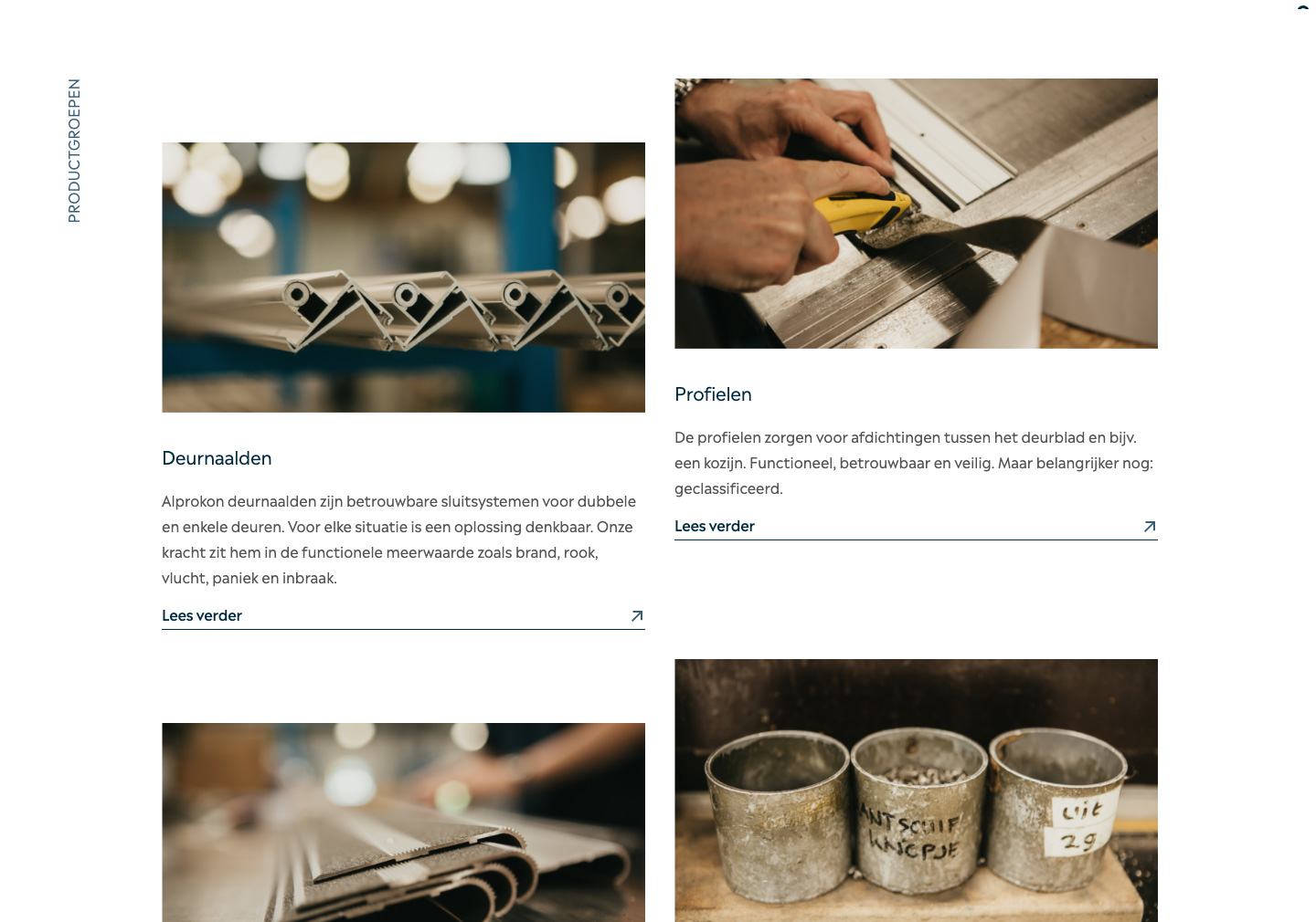
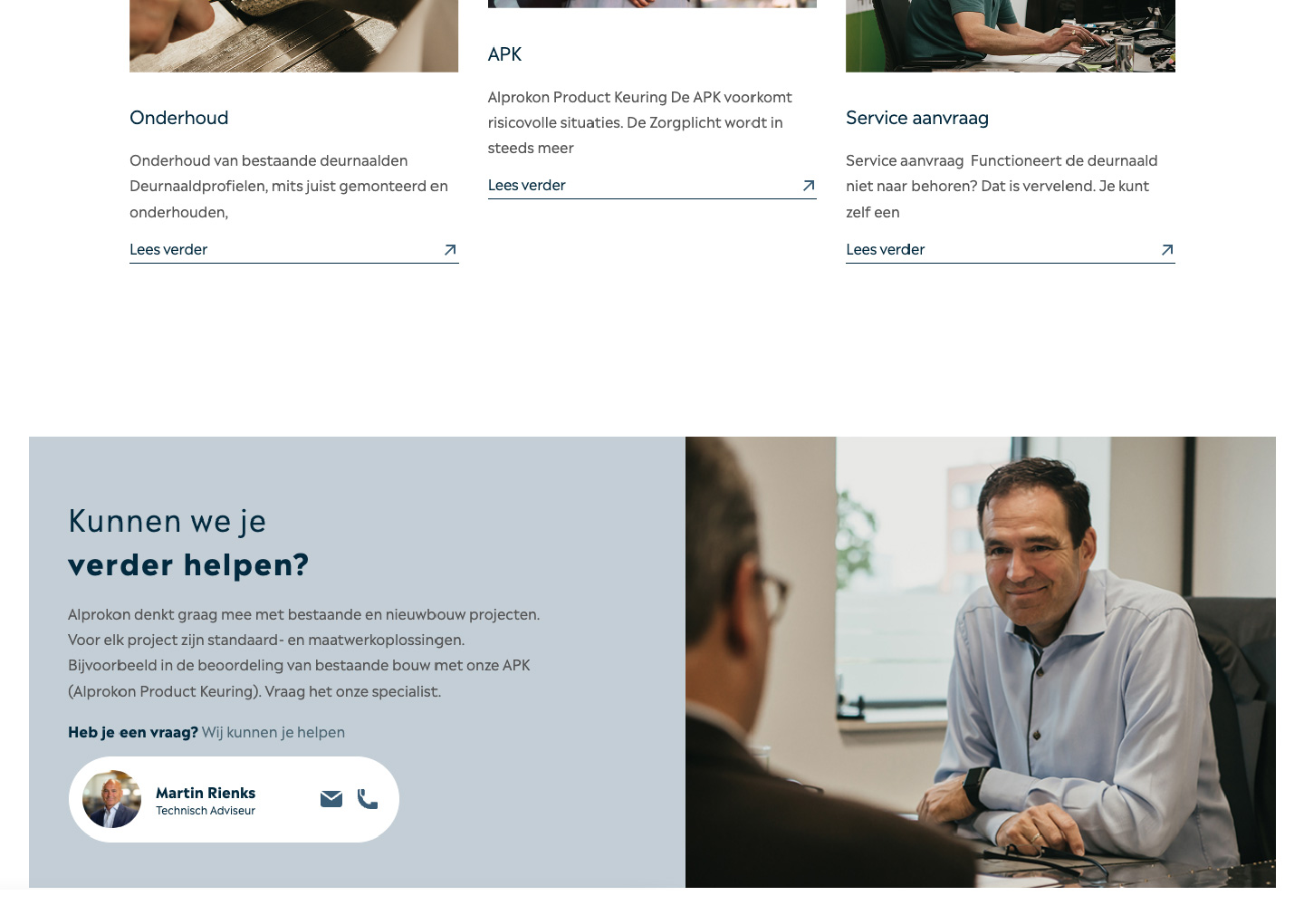
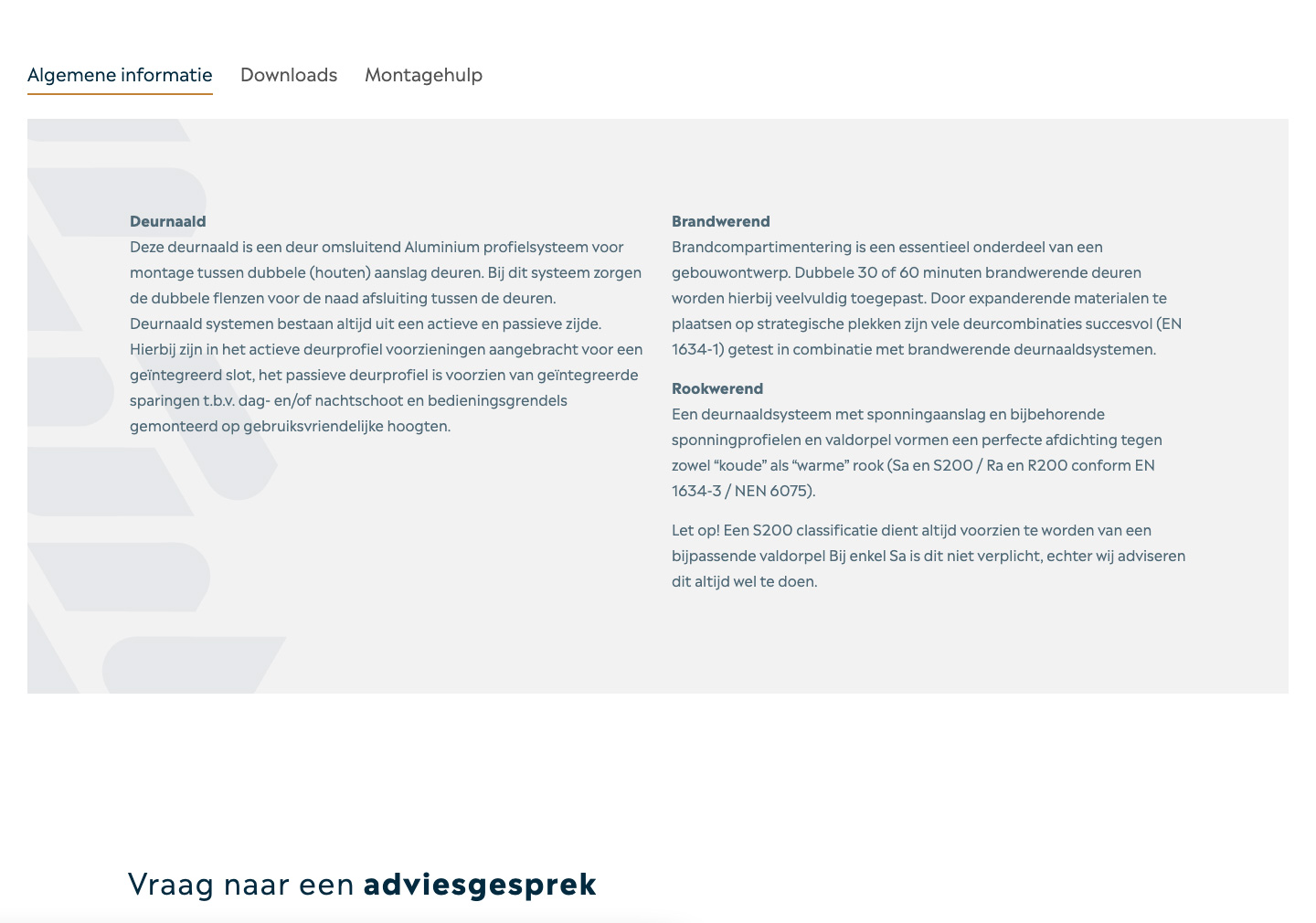
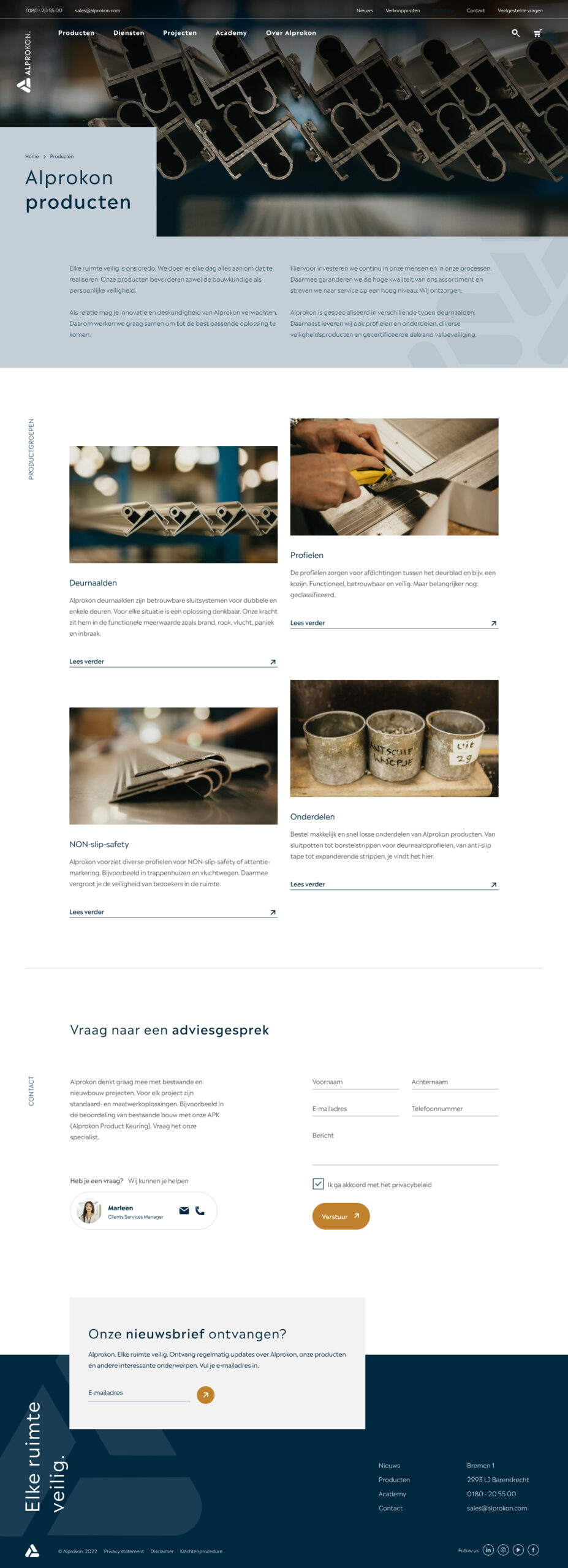
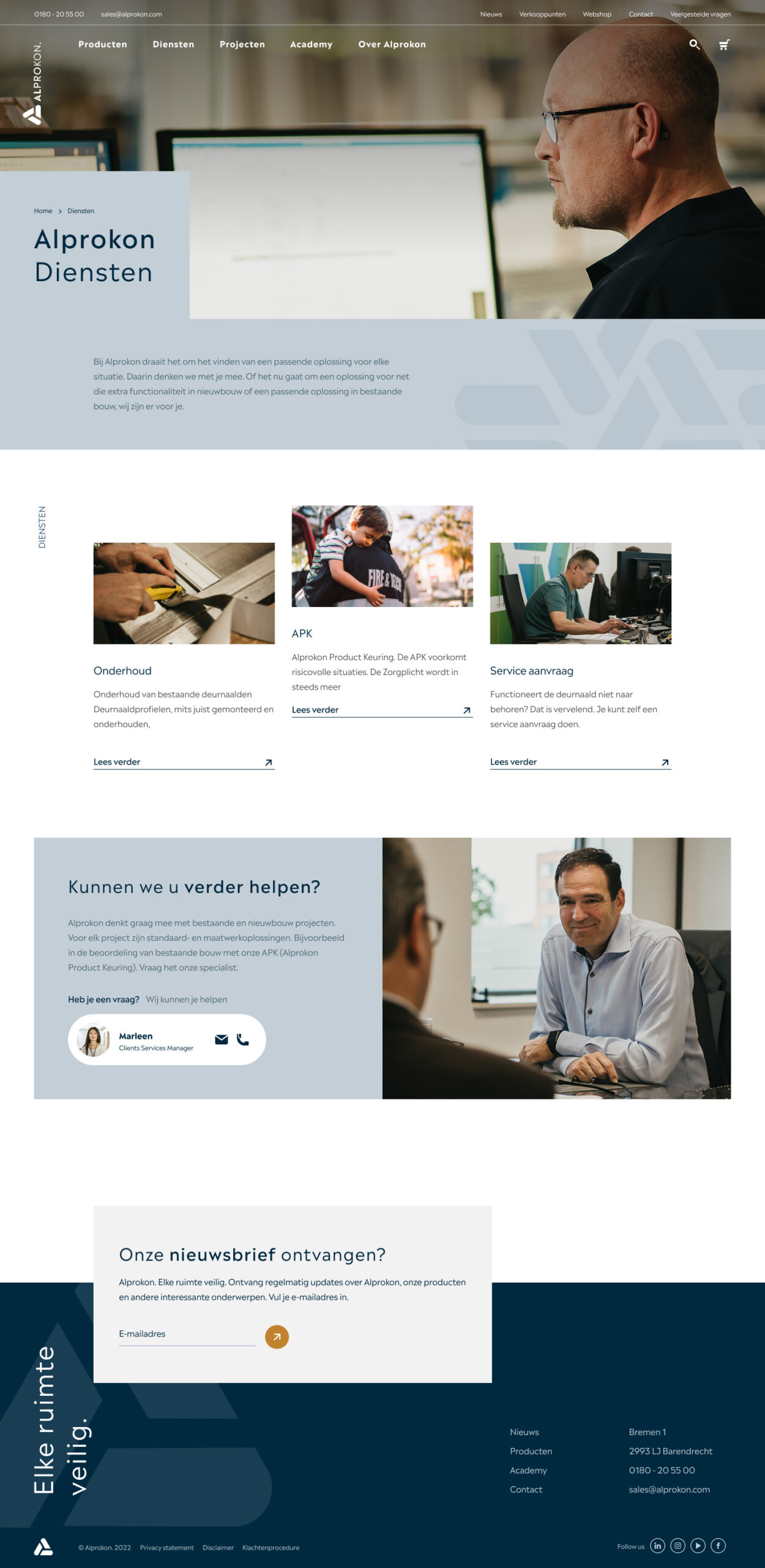
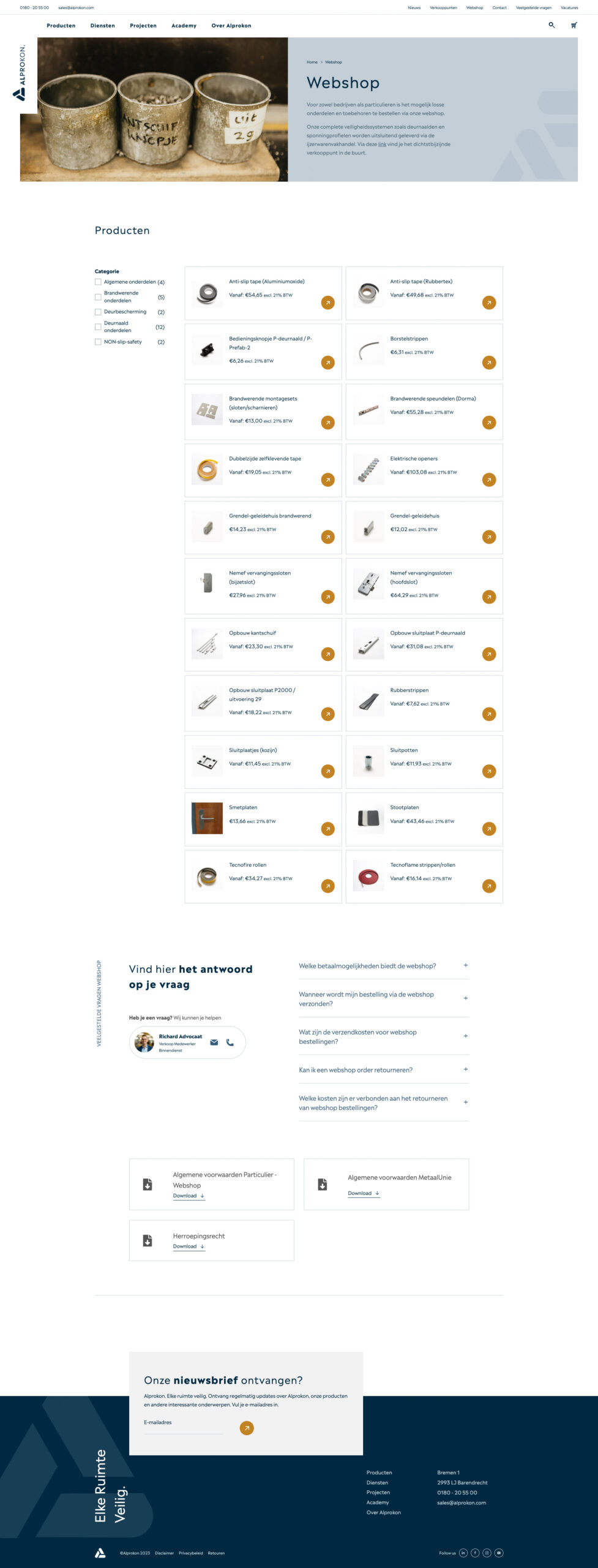
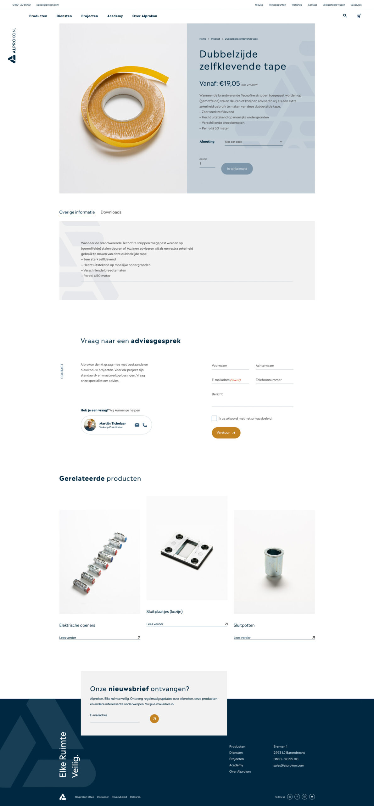
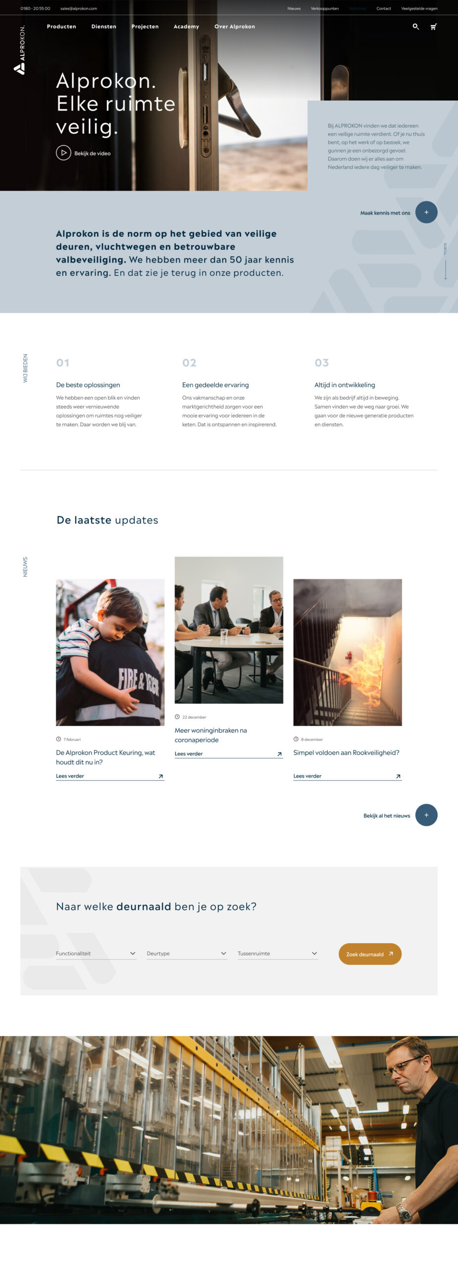
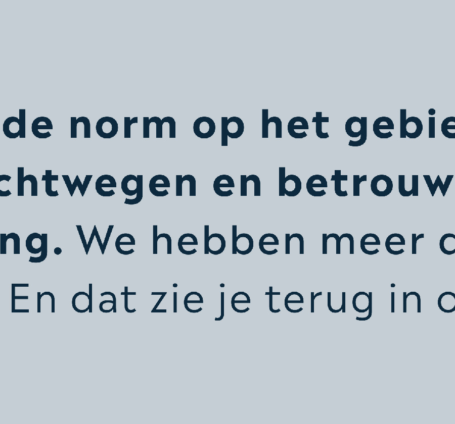
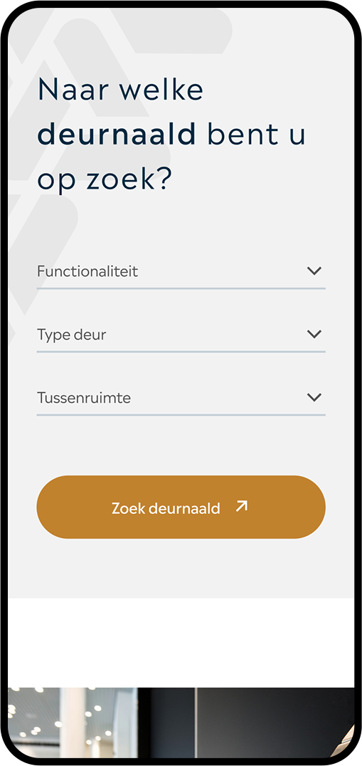
Alprokon is the biggest manufacturer of meeting stiles in the world and the standard when it comes to safe doors, escape routes and reliable fall protection. They have more than 50 years of knowledge and experience. To emphasise all that it was time for a new brand and website.
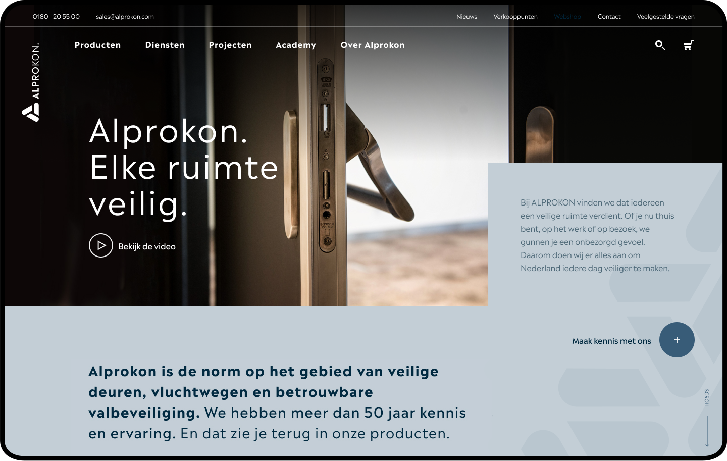
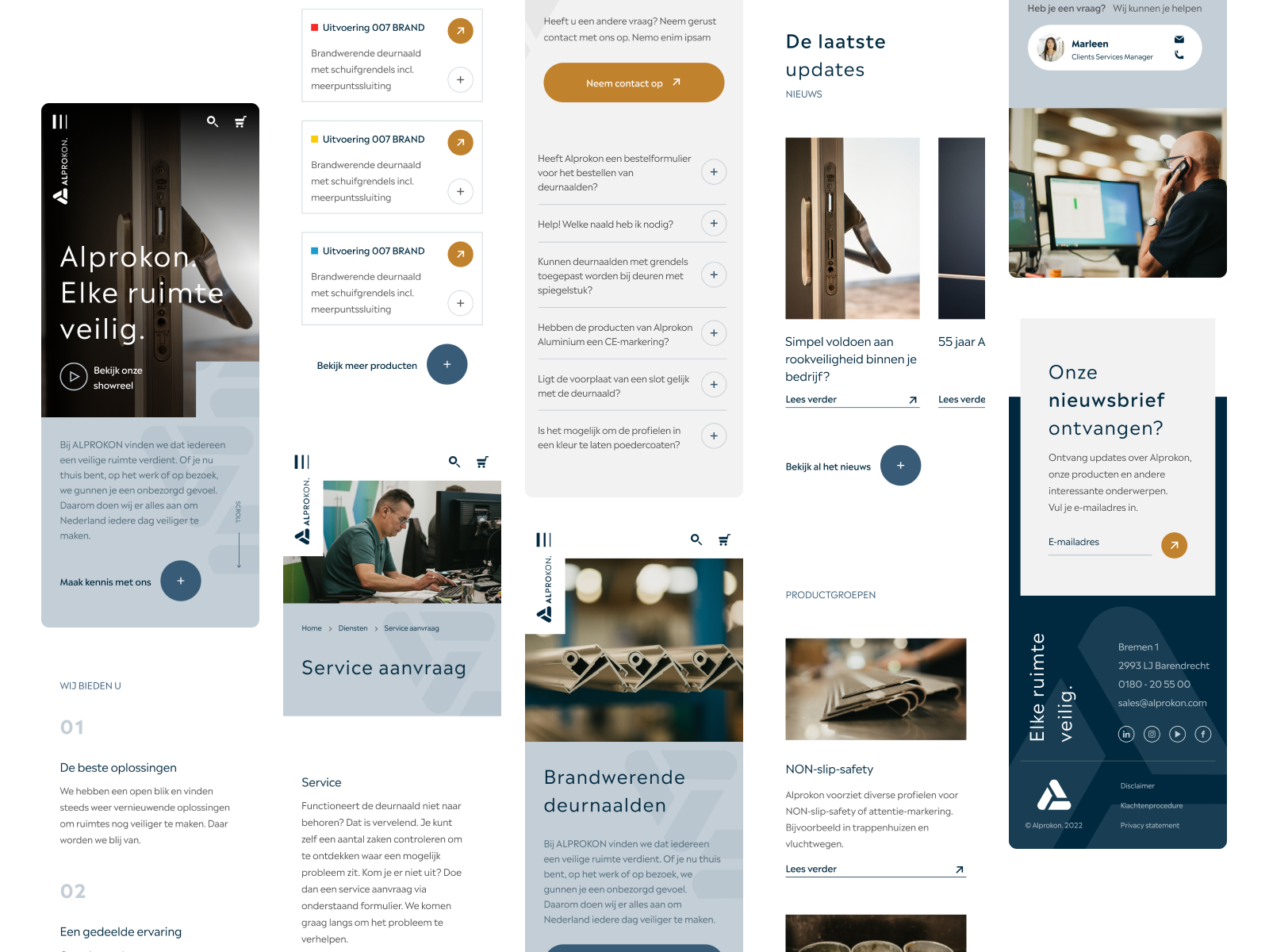
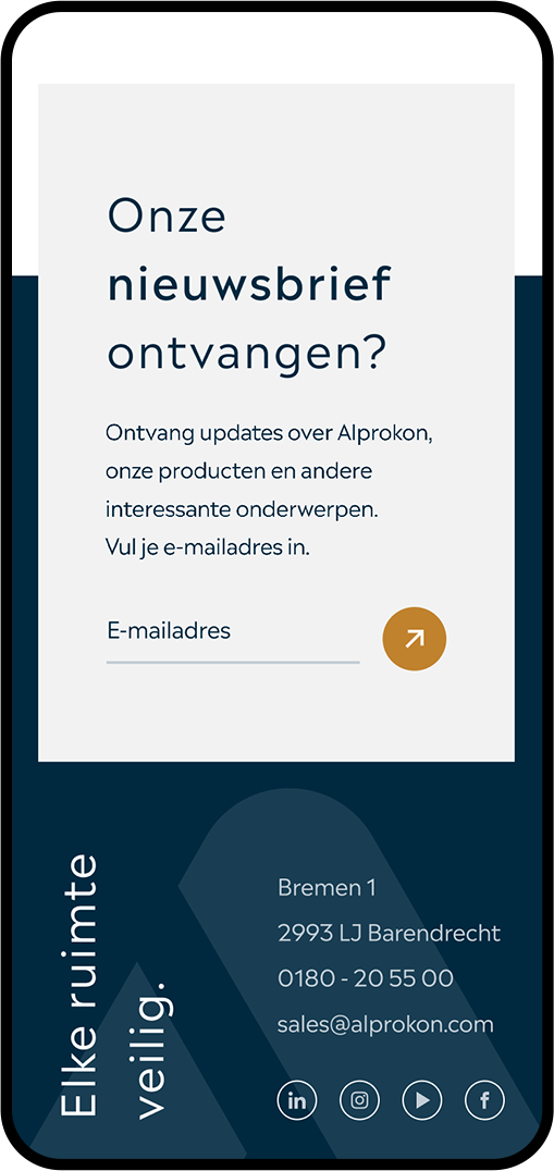
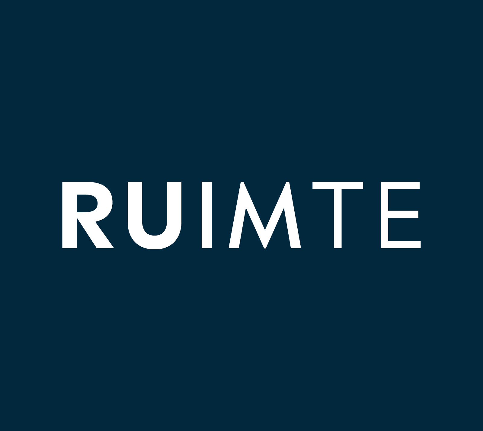
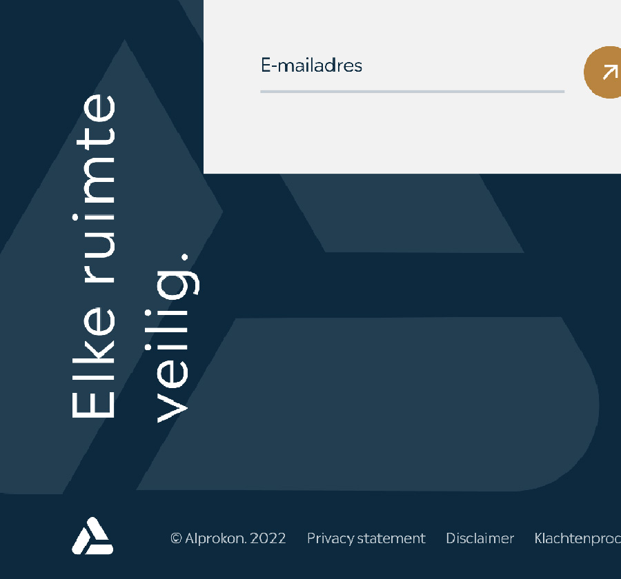
Elke ruimte veilig.
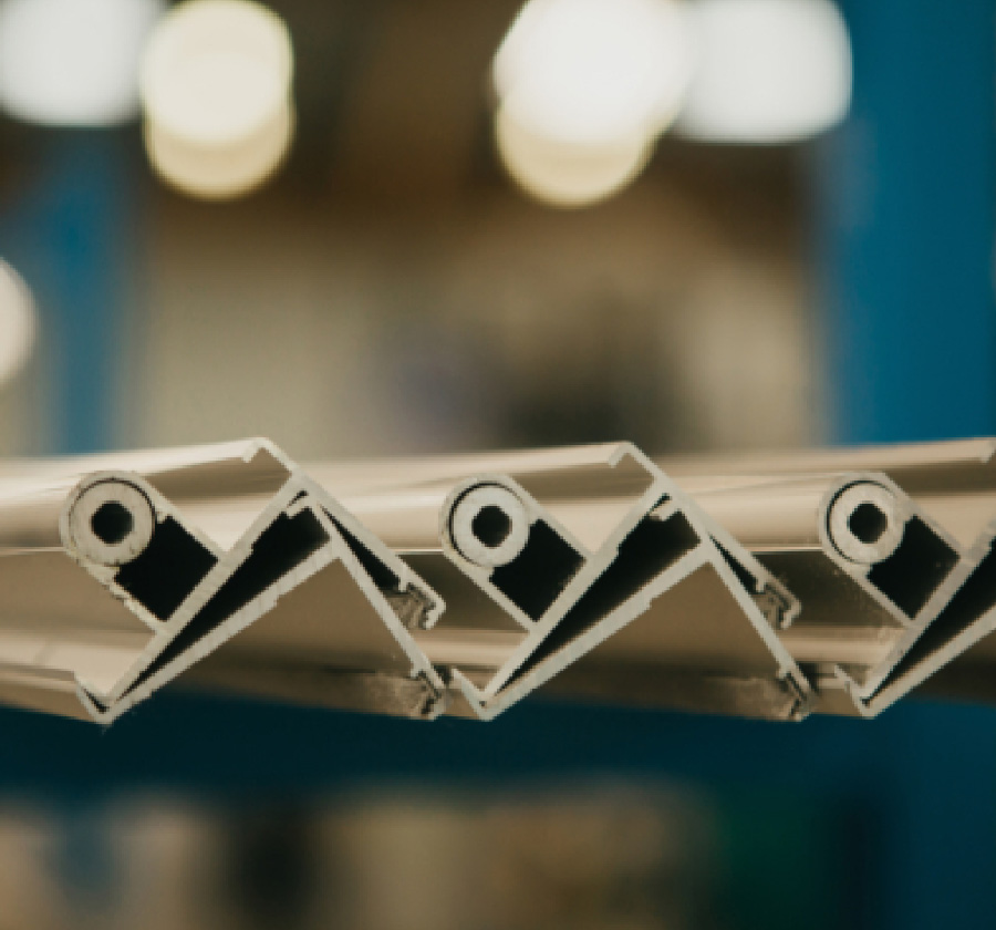
The word space (ruimte) is the basis for the concept and the visual identity. Secure the space in the most beautiful and smart way possible, but also room for development and new solutions. The current logo is the basis of a faceted pattern, which visualizes the versatility and room for innovation.
With that, the start of the new branding was born. A fresh logomark, a pattern, new font family and a new style. The word ‘space’ can be interpreted in multiple ways in the visual design. More breathing space, white space, attention to details, playing around with typography, and give the product space to stand out.
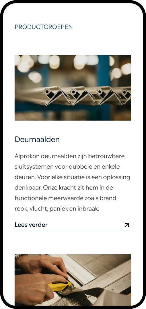
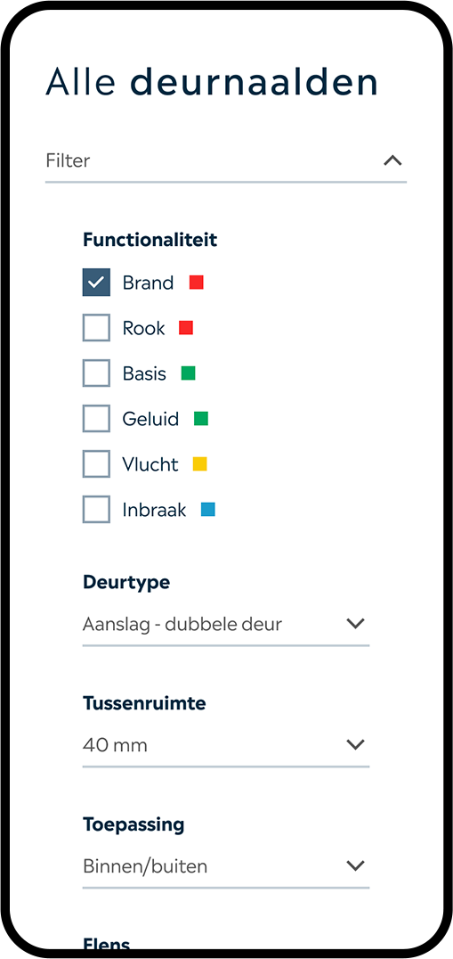
Attention to details


Design bits & pieces