fc utrechtwebsite
Client
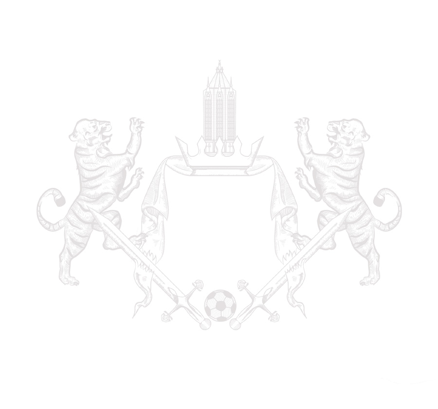
FC Utrecht
Year
2019
Agency
The Valley
Services
Visual design
Online branding
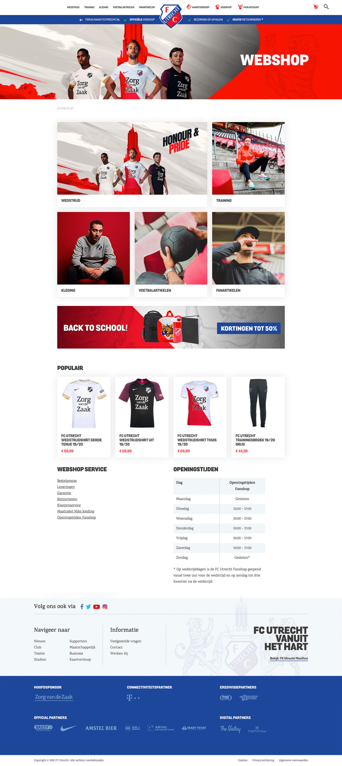
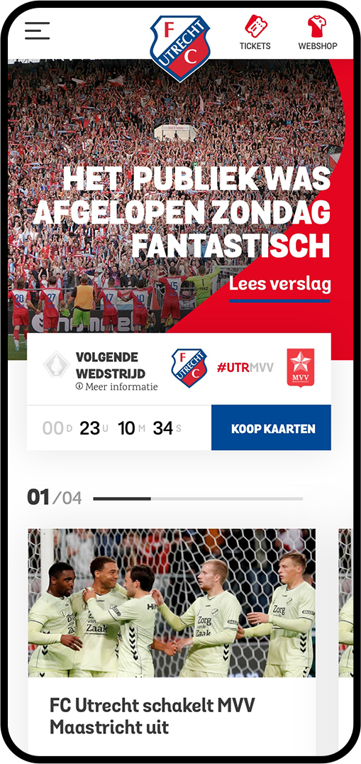
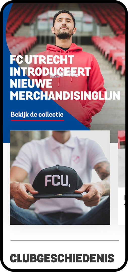
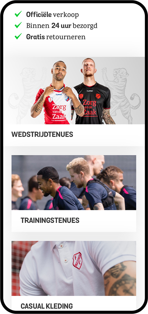
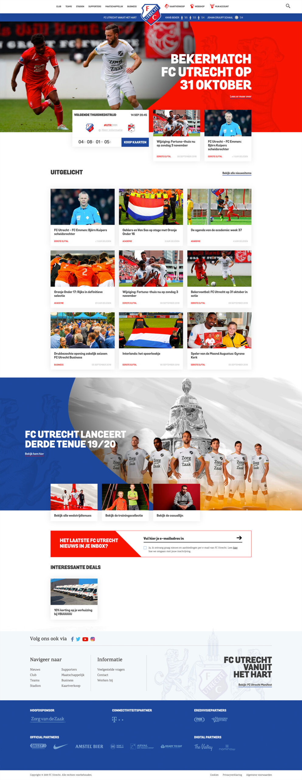
The assignment was: make FC Utrecht online champion of the Netherlands. How? By building an ultimate fan experience. FC Utrecht wants to involve the fans more in the club and the website must 'breathe' more football. A platform was created with which the fans identify, where the club's successes are highlighted, where all information can be found easily and conveniently and where fans are addressed on a personal level with personal offers thanks to a fully integrated data platform in the background.
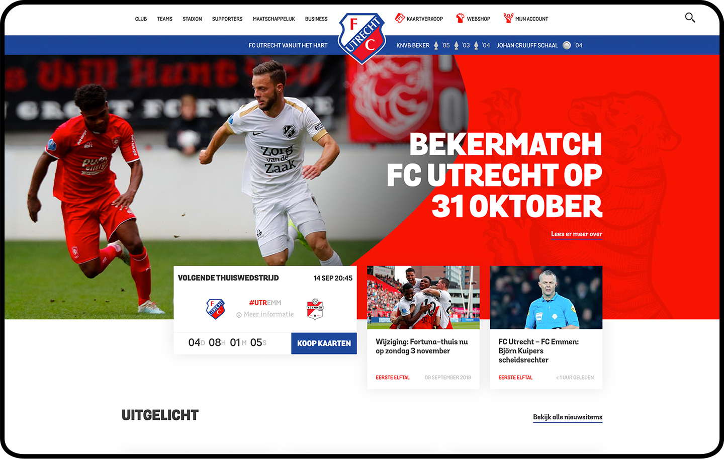
Online identity
I wanted to make a unique shape that could identify FC Utrecht online. The diagonal of FC Utrecht is of course very well known. This is in the city coat of arms, in the club coat of arms and on the shirt for many years. But this is (unfortunately) not a unique form. I continued to look at what makes FC Utrecht unique and what is more unique than the logo of the club itself? Then I started working on this.

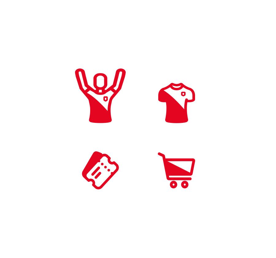
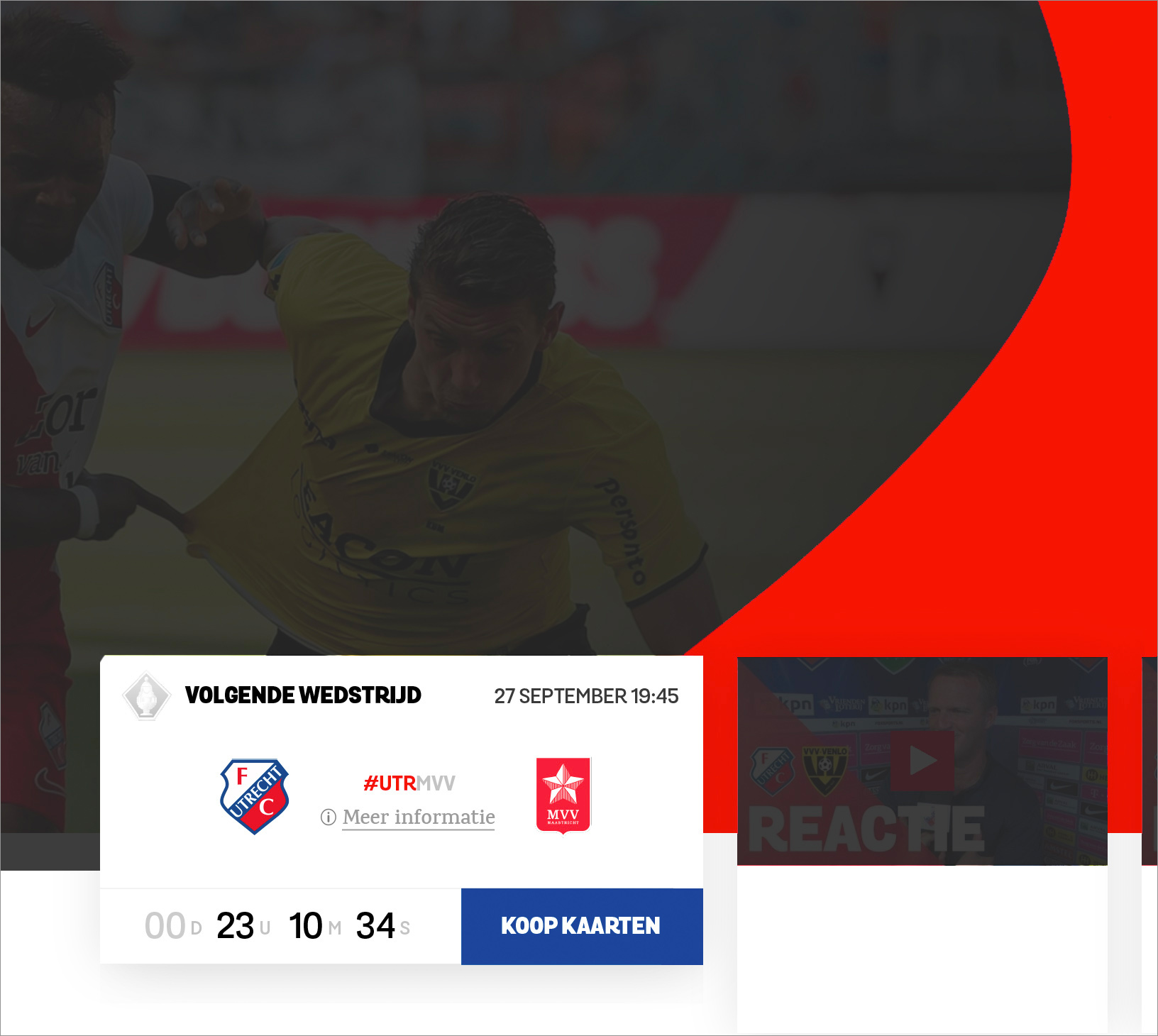
Functional
The most important thing about this form is the way it unconsciously directs the visitor’s eyes to the most important block on the homepage: ticket sales.
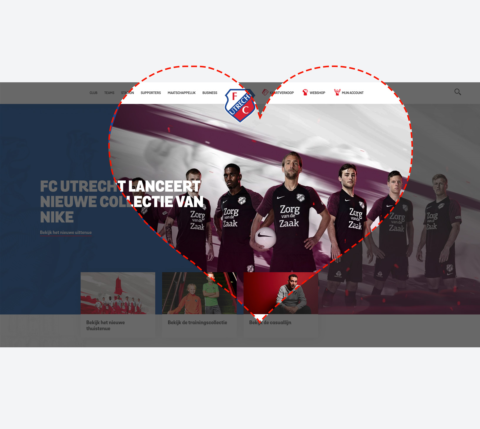
From the heart
In addition to being functional, this form is also symbolic. The diagonal remains upright, but it bends to this new shape. It symbolizes the shape of a heart. The credo of the club.
Attention to details