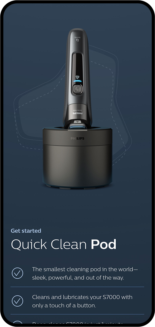
philipss7000 shaver
Client
Philips
Year
2020
Agency
CODE D'AZUR
Services
Visual design
UX*
*Assisted with
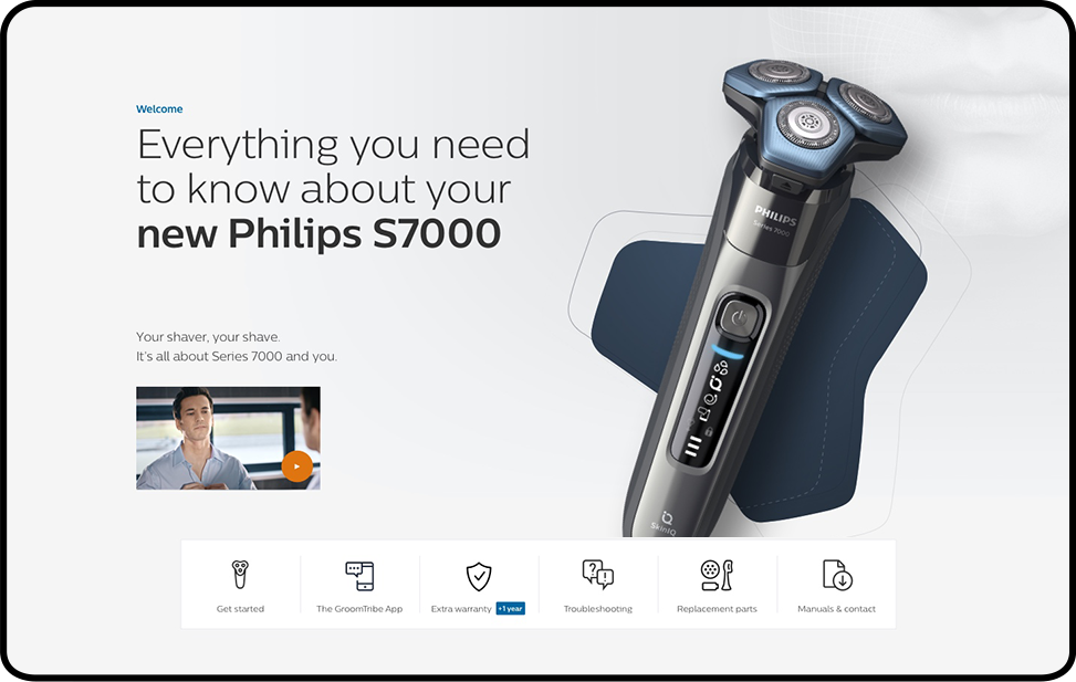
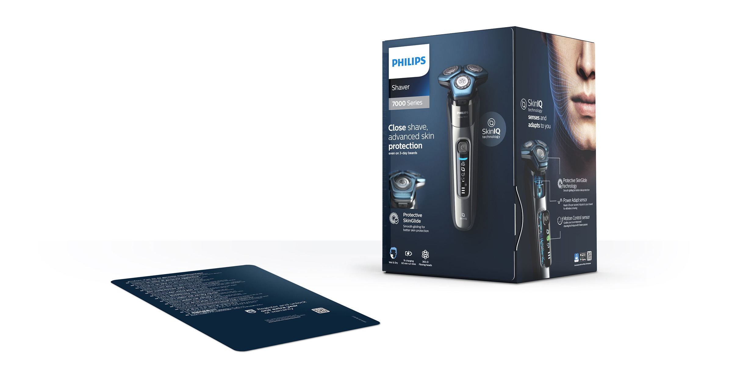
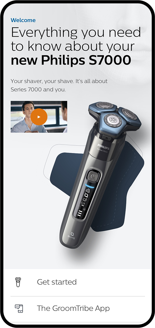
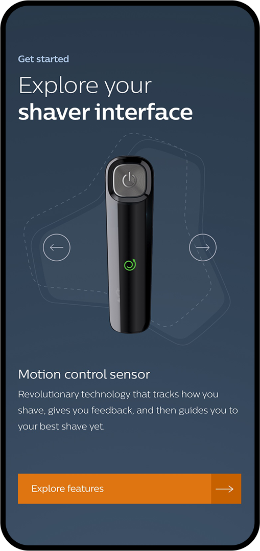
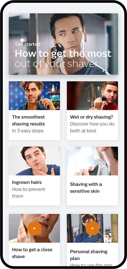
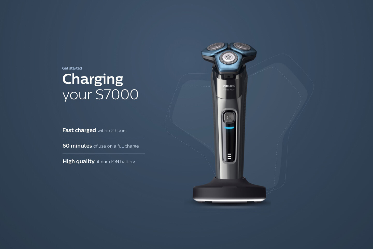
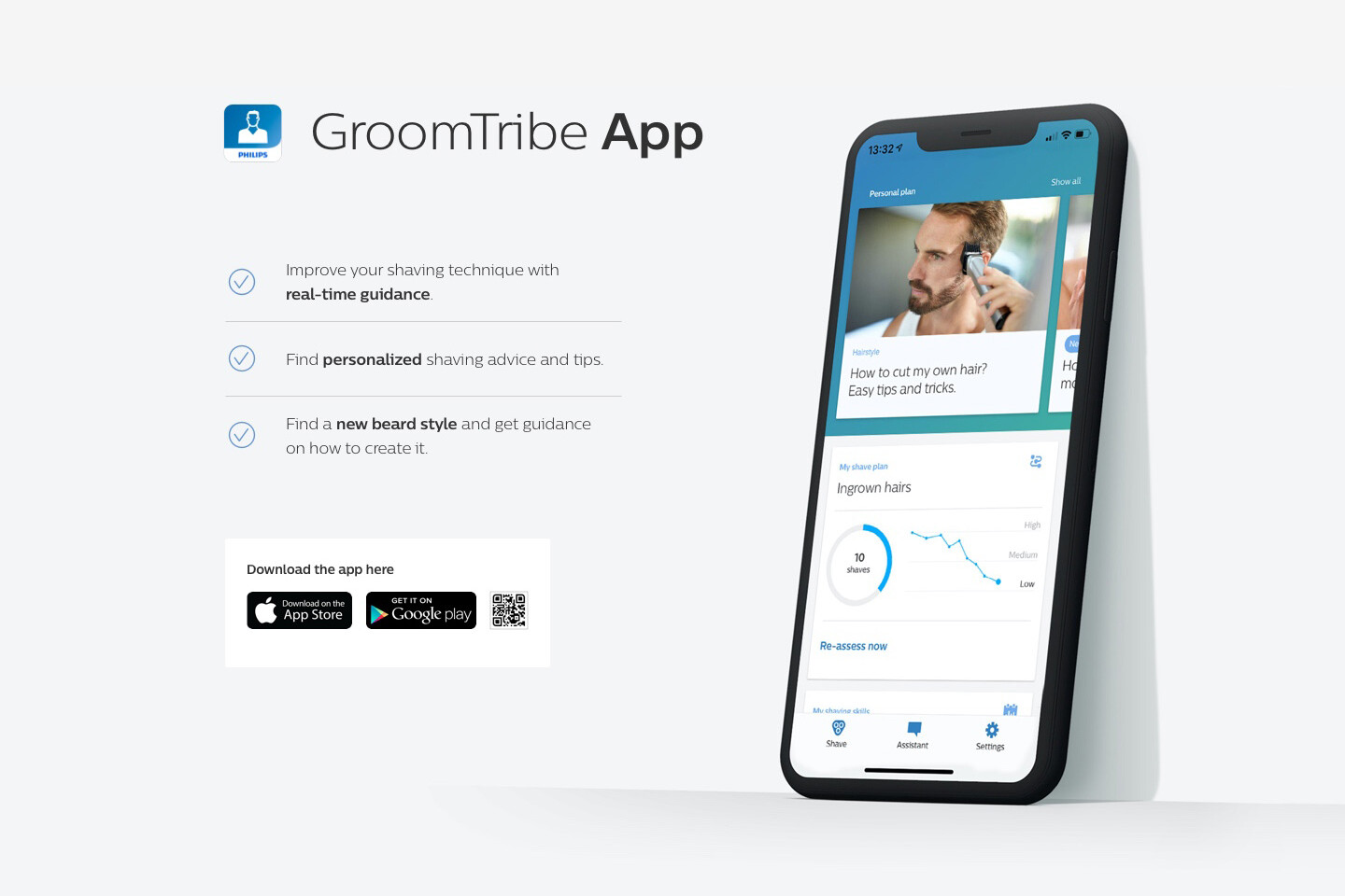
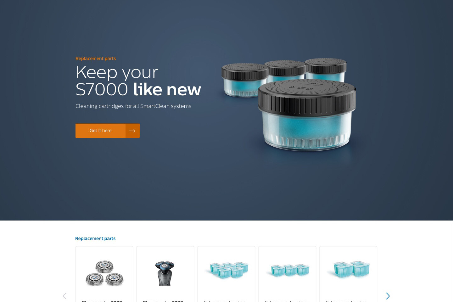
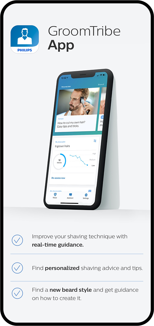
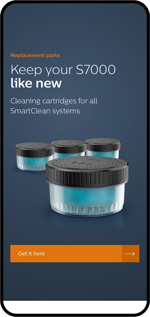
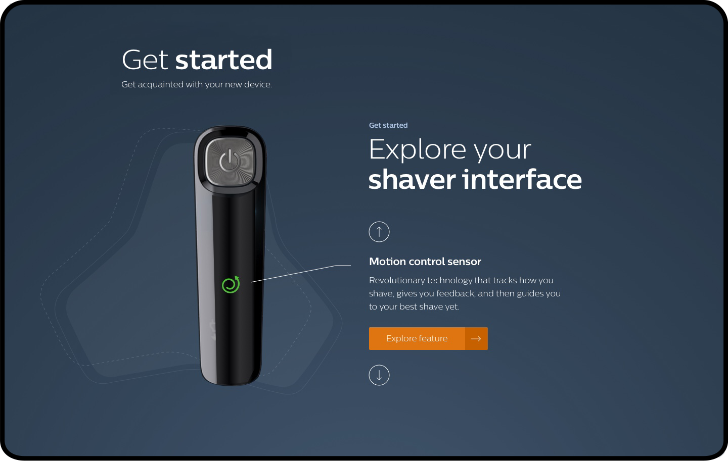
For the Philips post purchase page I had to solve the following problem; in and around the packaging of the new S7000 shaver were six different QR codes. All of them leading in different directions and to different landing pages. Users couldn’t find the right information and got lost. Solution: Create one single landing page for all QR codes where the user can find everything he’s looking for.
Post Purchase
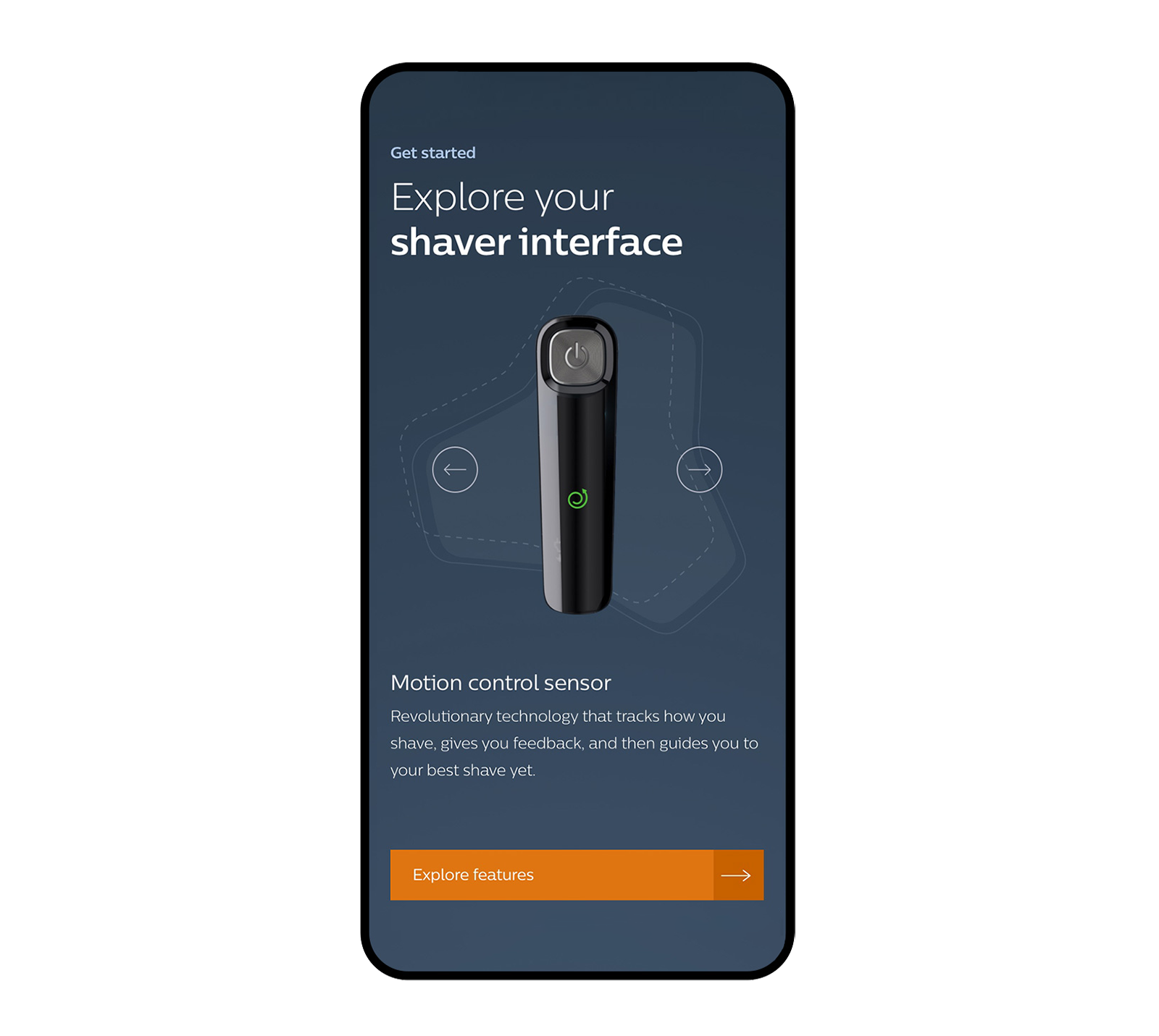
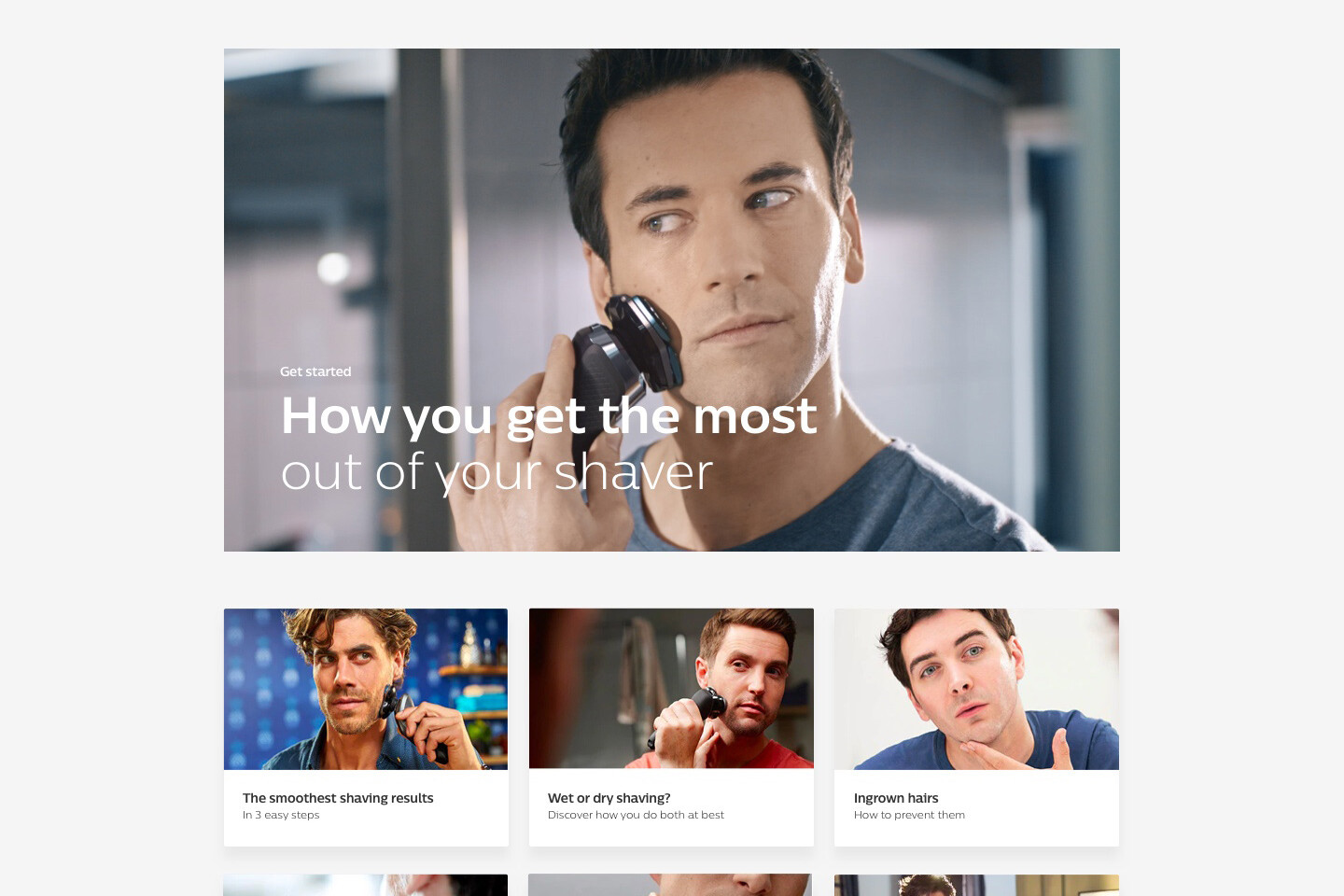
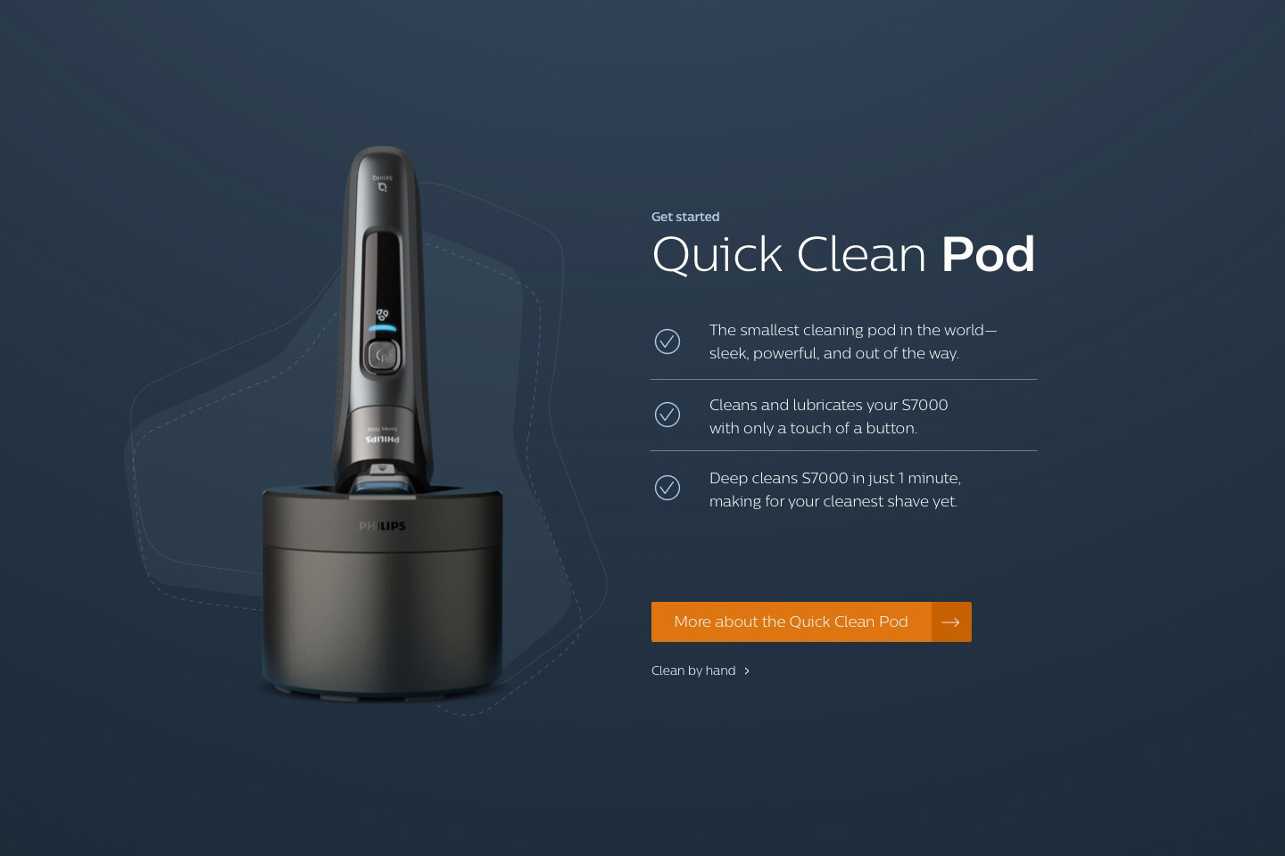
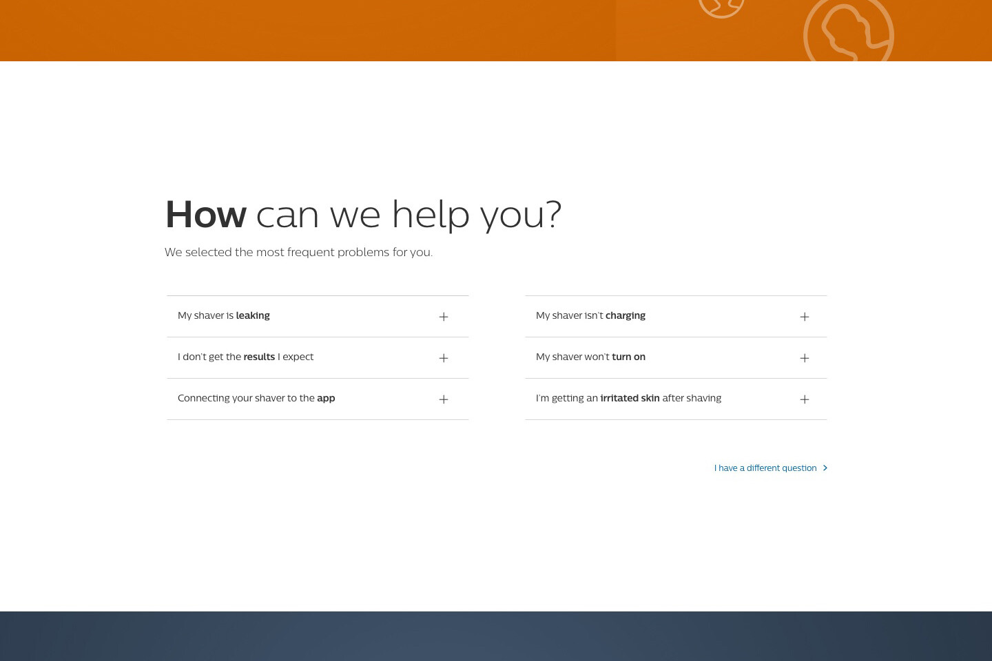
The post purchase page is a place where people go to for more information, for support or other questions they might have after purchasing the product. This is part of the product experience and should have the same look & feel and excitement as the pre-purchase experience.
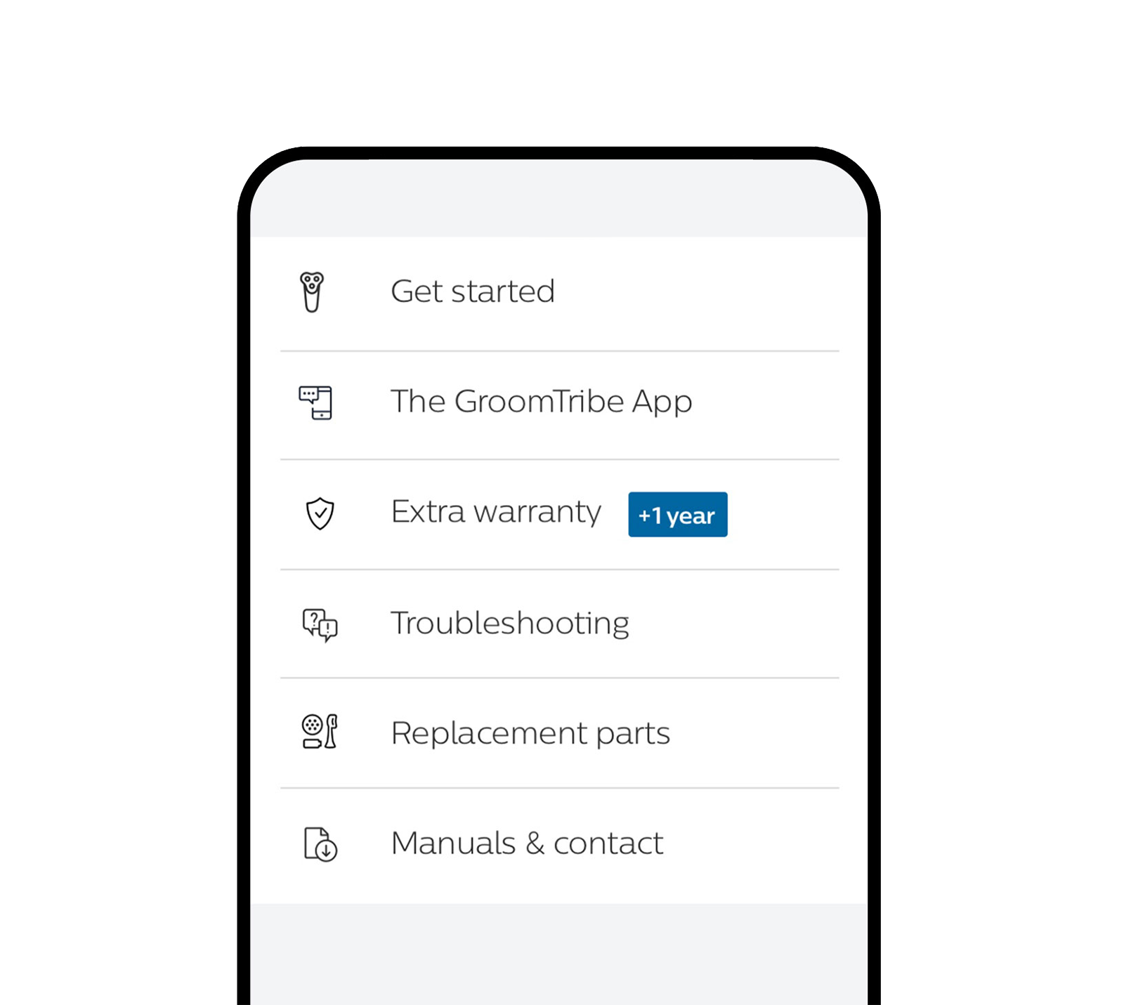
It’s an important place to get and keep hold of you target audience, to support them in any way you can and to give them a clear and friendly overview of the product and information. After gathering the information of all 6 different QR codes, prioritising, filtering, reseach and looking at statistics, the landing page got a complete redesign.
Related Posts
25 maart 2022
KLM / Tech & Data
When you are alone for days or weeks at a time, you eventually become drawn to…
