greenchoicemijn omgeving.
Client
Greenchoice
Year
2019
Agency
The Valley
Services
UI design
Assisted with UX
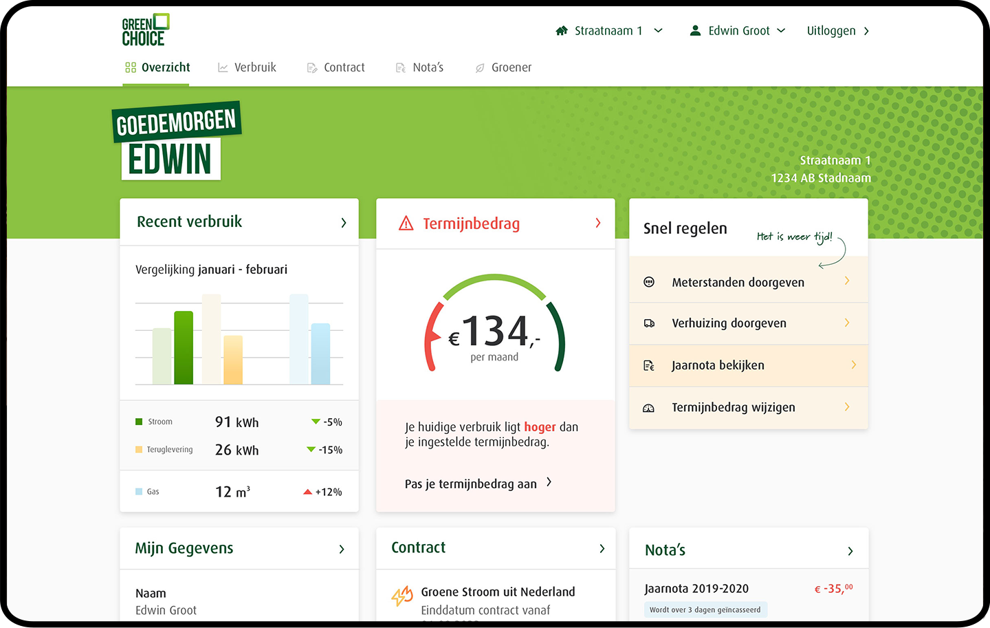
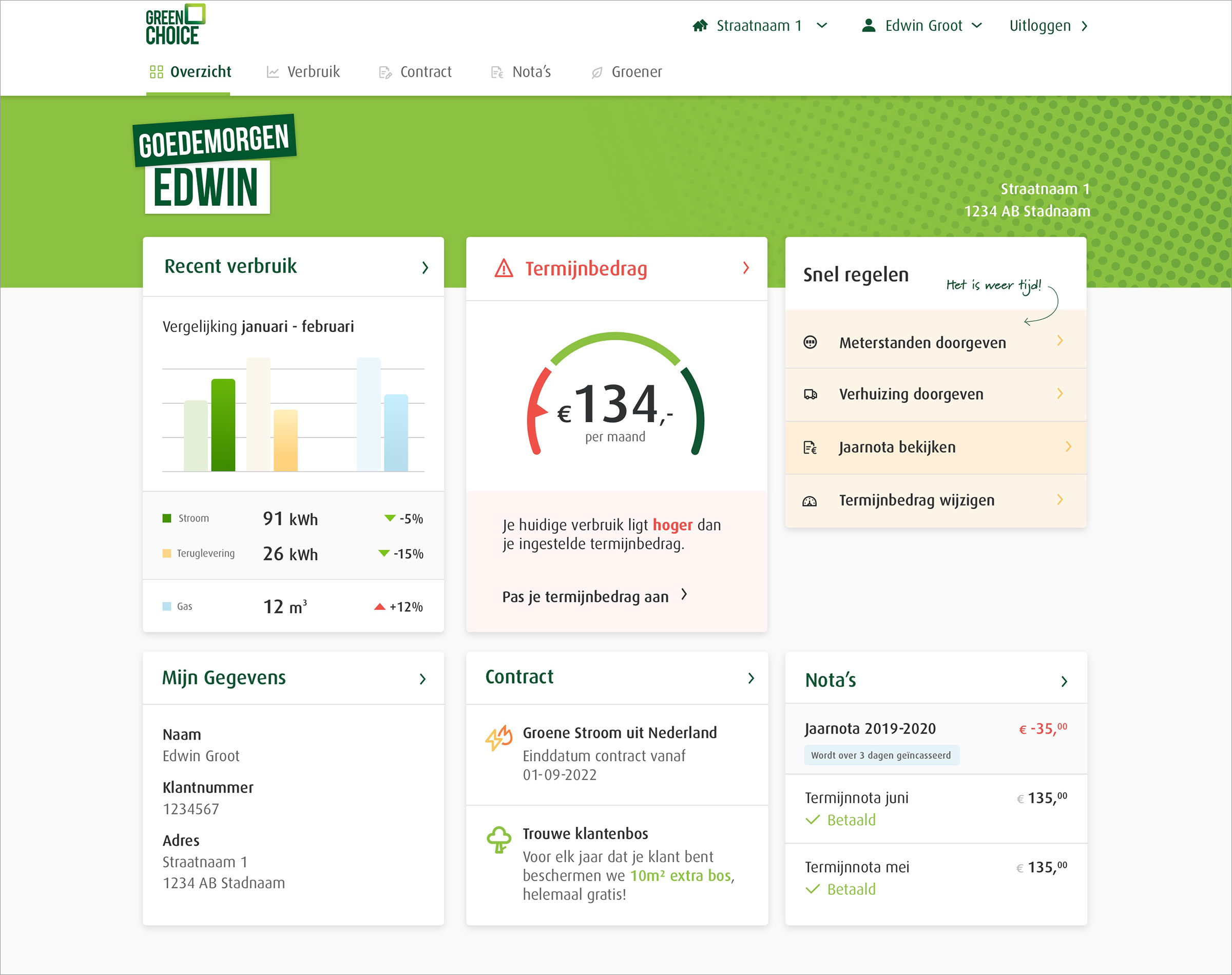
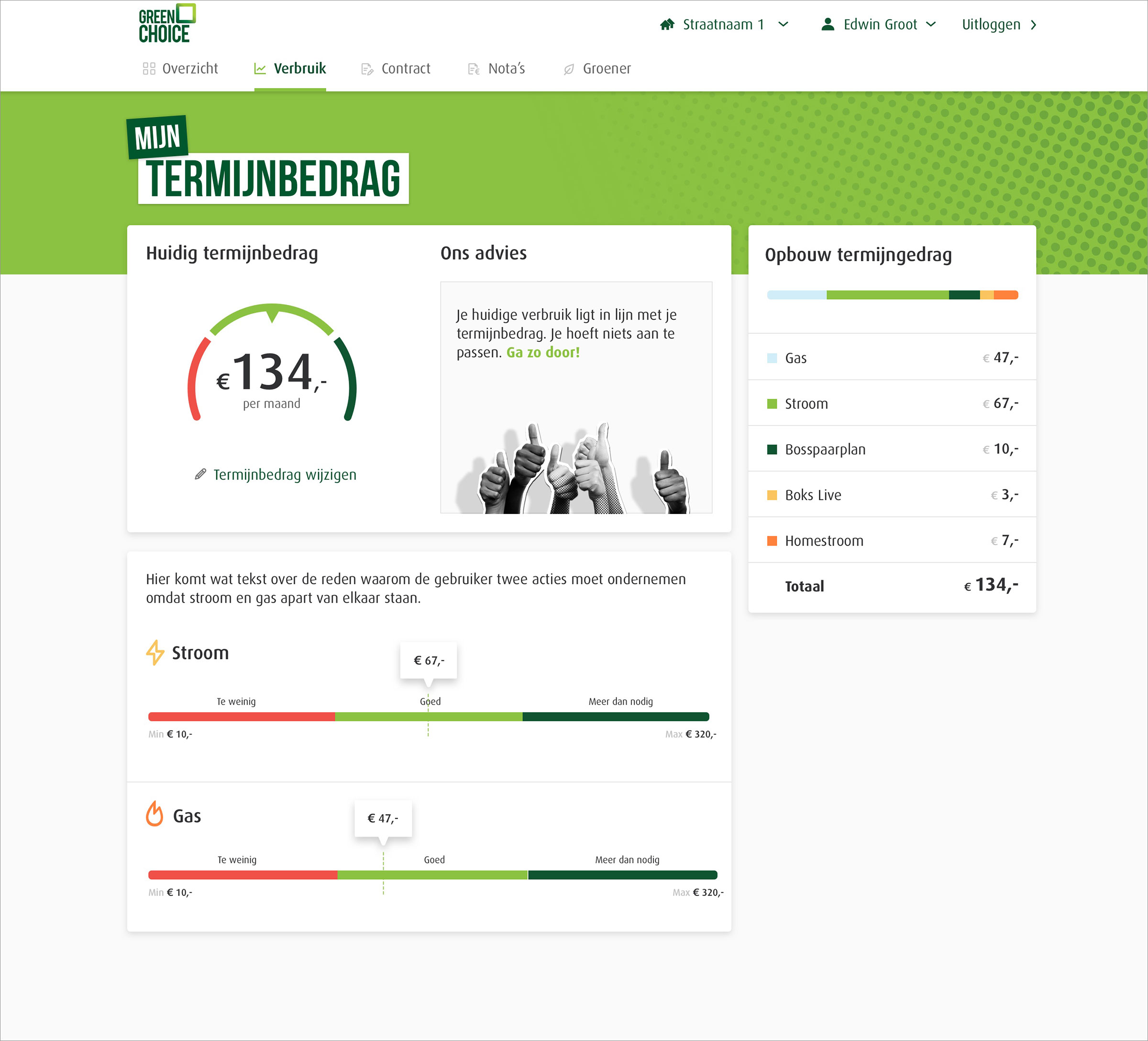
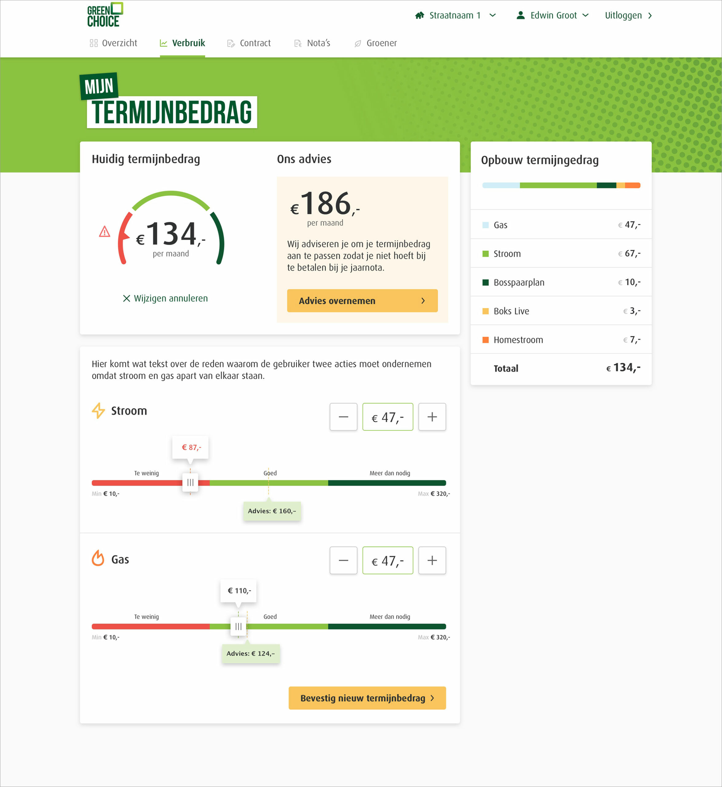
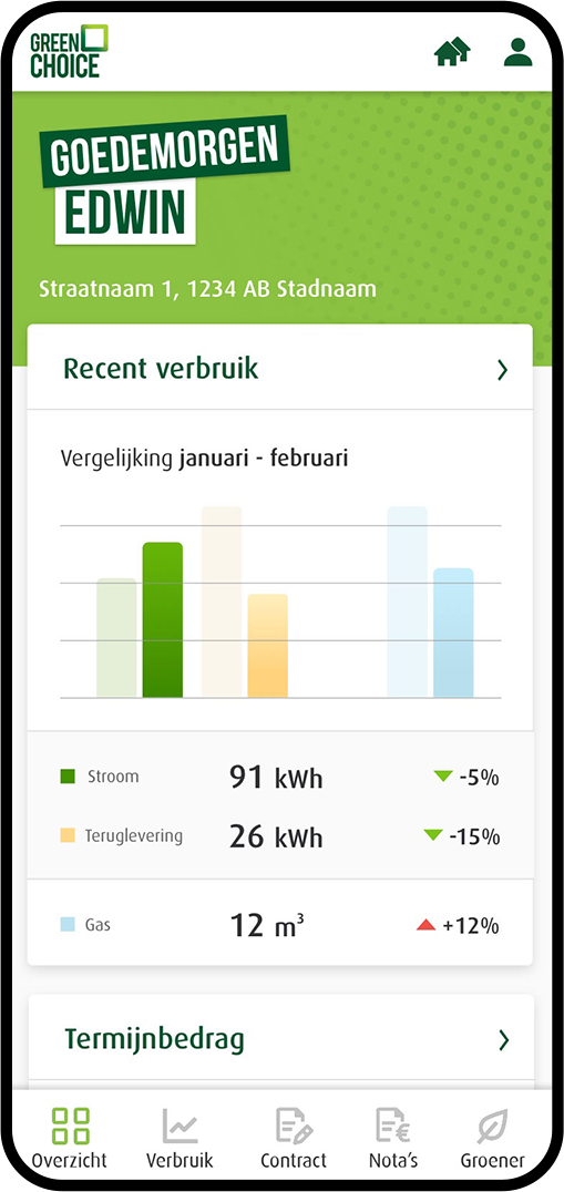
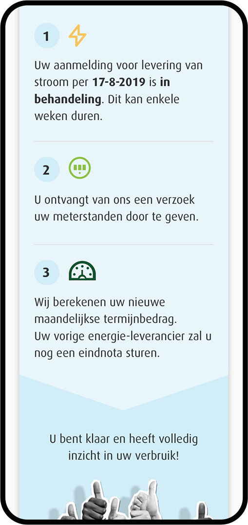
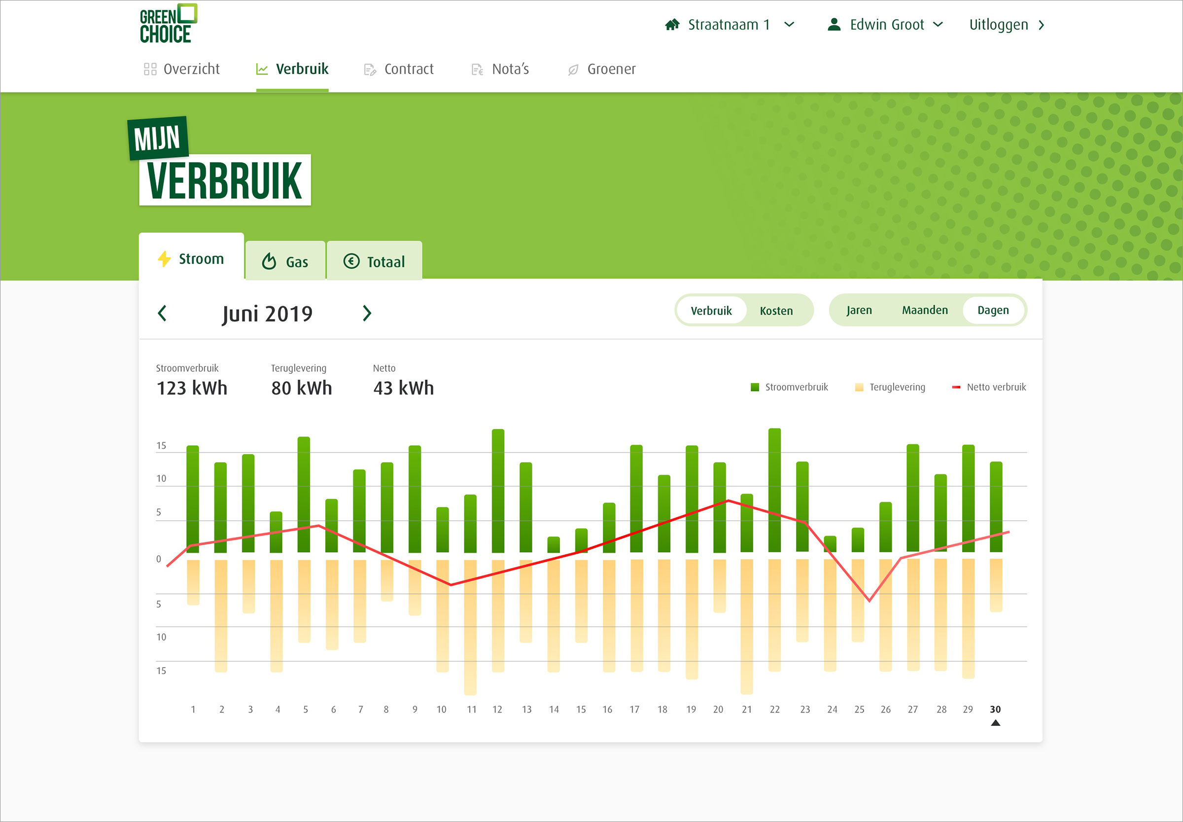
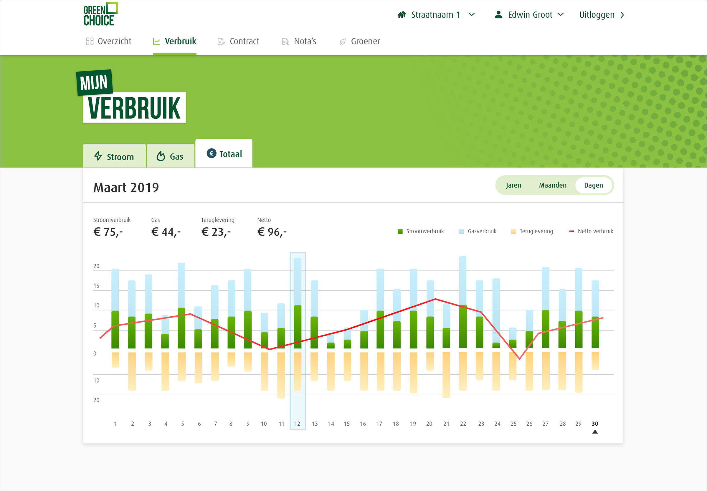
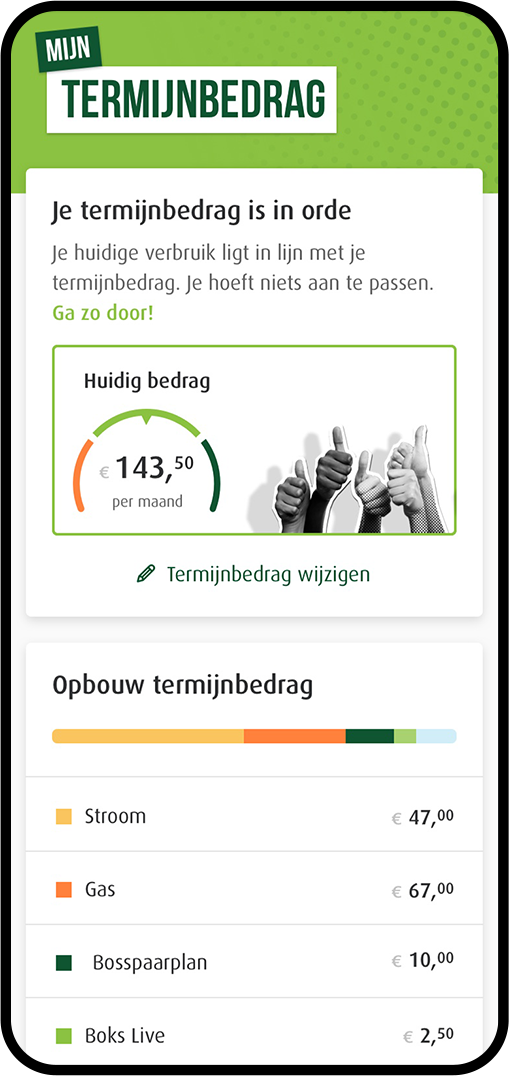
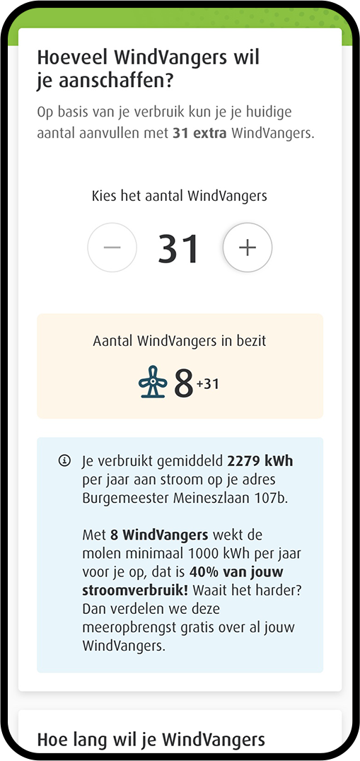
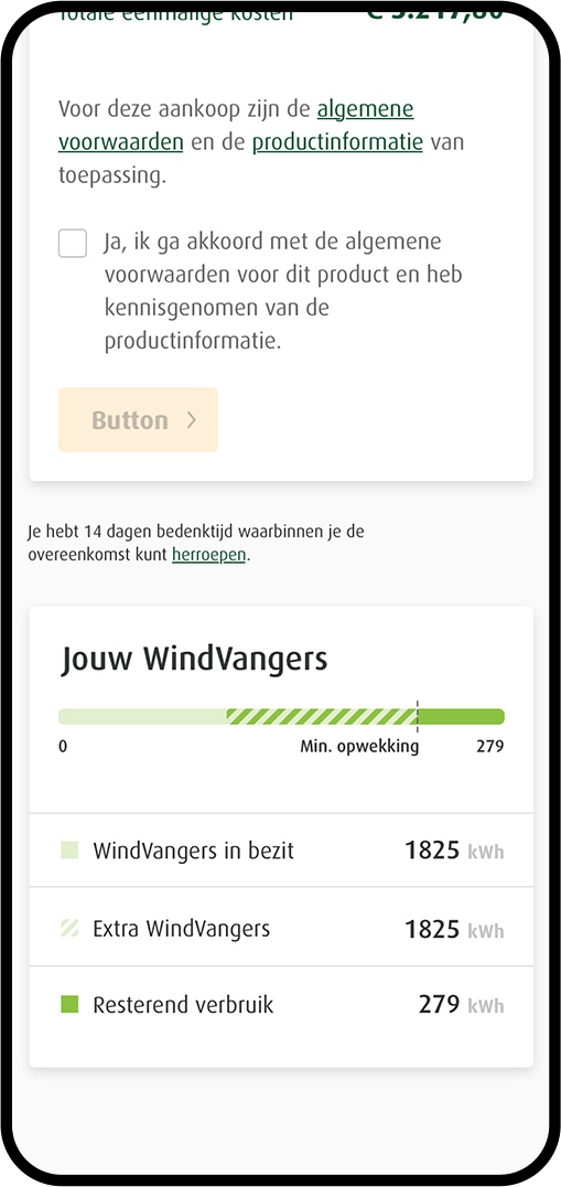
For energy supplier Greenchoice I helped strengthen and optimize the (online) customer experience. The outdated 'My Environment' (My Greenchoice) was rebuilt from the ground up based on the Atomic design system. This also meant a completely new User Interface for all customers of Greenchoice.
Visual language
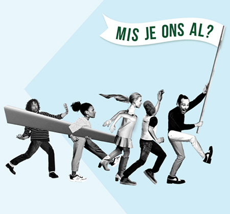
On one hand, Greenchoice gave the assignment to seek freedom with the visual style of the new ‘my environment’, but on the other hand, it had to be clearly Greenchoice at first glance. They position themselves as activist, daring, enthusiastic and personal. These were elements that I could use to determine the visual style.
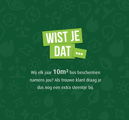
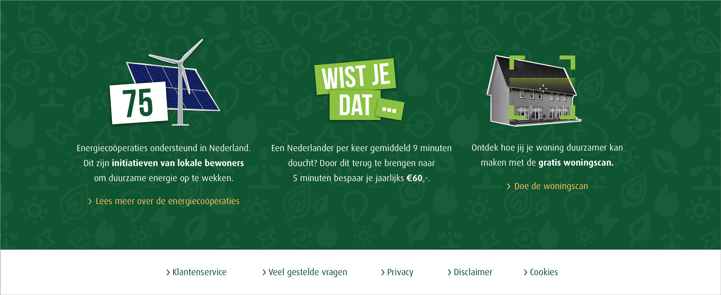
The elements show activism, positivity, enthusiasm, accessibility. Ensuring a cleaner and greener world is also certainly reflected in the platform with several facts and trivia and with the call to opt for greener / more sustainable options.
